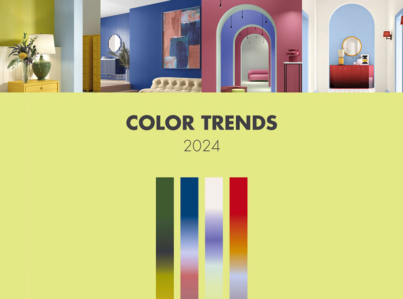
four stories open the doors to Color Trends 2024
BULANTE and the Milan-based studio Baolab introduce new Colour Trends, which now also communicate with floors and outdoor spaces

More light, vitality, and lightness - an evocative foray into the digital world, and an extension to floors and outdoor surfaces: these are some of the distinctive features of the Colour Trends that BULANTE has identified for the new year. The four colour panoramas were defined through research that the brand – leader in the production and distribution of paints and varnishes for professional construction – has promoted for the second year running in partnership with Baolab, a Milan-based studio specialising in product strategy, materials research, advanced technological processes and trend analysis.
The path taken to define them is based on a principle of evolution through continuity. As proof of the brand's far-sightedness, the result of the research has led to a development and expansion of the palettes identified last year, with several colours being confirmed alongside new ones. Plus, the Color Trends now also include some colours for exteriors, and colour-matching proposals for floors that feature Continuo, the elegant micro-cement effect decorative covering system.
The name of the first trend identified is Spring Garden, a palette that elicits an awakening of the senses, charging them with a new energy and a feeling of cheerful lightness: an authentic spring breeze billowing across a rural garden. A certain continuity from the previous palette, Bucolic Garden, is thus perceived. The colours that make it up, however, become more saturated, as in the case of the greens and yellow, which bathe all the other colours in light. For floors, the choice falls on Continuo C628, a shade dominated by neutral yet warm accents; the soft yellow and green of the Firenze and Trieste shades are recommended to match this palette to the exteriors.
Soft Purity, the second trend identified, is a palette in which the sky and earth merge to create dreamlike, fairy-tale settings: a universe characterised by soft, tactile surfaces on which light dapples and plays with the volumes. Blue still prevails, this time together with red, but both are transformed by the high percentage of white which makes them more homely and intimate. Balancing the palette are two strongly tinted neutrals, which communicate with the strongest hues. For floor coverings, Continuo C638, which with its mellow yellow recalls warm summer sand, is proposed as a match. For exterior walls, the focus is on delicate colours such as Turin pink and Catania blue.
Digital Sensorial is the name of the third trend, this year's new entry, which conveys the world of digital inside: no longer confined to a screen, it takes over surfaces and objects, creating flowing and metamorphic environments. The new palette reflects this transition: it is made up of vibrant purples, yellows bordering on greens, and greens that are made lighter to allow continuity and a hybridisation with the more neutral and traditional shades. Flooring blends perfectly with this futuristic space thanks to Continuo C646: a very soft, light and fresh shade of green that, when combined with stronger tones, gives strong character to living spaces. The balance with the exteriors is ensured by the Venezia and Milano nuances, which are two light and delicate colours.
The latest trend identified is Light Beauty, marked by a firm earth connection: whether brick, powder, ochre or terracotta, the distinctive tones of the previous version, Quiet Beauty, are still very much present. However, the colour panorama is enriched by a light blue-lilac that lightens it, transforming the orange into a burnt red that acts as a counterpoint to the other shades. The flooring proposal is Continuo C617, a delicate and intriguing pearl grey that conceals multi-tonal shades. The perfect union with the exterior walls is provided by two colours that enhance the pleasant contrast between a bright Rome red and a more subtle Naples cream.
"With the Color Trends project, we aim to take our audience - both trade professionals and private individuals - on a captivating journey among the inspirations and emotions that bring the world of colour to life," comments Emanuele Divina, Brand Manager, BULANTE. In particular, we want to provide original keys for interpreting interior design trends while remaining true to one's own taste and personality, as well as hints and tools for creating harmonious and balanced spaces that are always unique and vibrant".
"We would like to thank BULANTE once again for giving us the opportunity to work on such a broad and interesting project, allowing us to avoid easy sensationalist short-cuts through forced launches of new palettes," added Manuela Bonaiti and Emma Clerici, founders of Baolab. It’s a rare chance to convey the idea that the colour world is constantly evolving and moves forward not only by radical direction-changes the potential of which may not be easy to grasp, but which is essential in order to structure a colour project that stands the test of time while being innovative in content.
The qualitative research conducted this year has also led to major improvements in the consultation tools, starting with the new colour palette, which will give an interesting comparison between the nuances of 2023 and those that will dominate the environments in the coming year.


